


Sometimes minimal changes to a logo can bring new life to a brand, in a big way. While the current ShopRite logo checks the box of recognizability, it lacks in general aesthetic, at least in my opinion. This revamped version of the iconic ShopRite logo keeps the brand’s general feel with familiar colors, script font, and historic shopping cart icon while giving it an updated look, suitable for the present-day.
Keeping some elements of the current logo in this revamp was essential so that the update could work complementary to the brands already established rapport. Not wanting to break the trust of the already loyal customer, these slight tweaks allow for a brand refresh that minimizes the risk of negative feedback from shoppers.
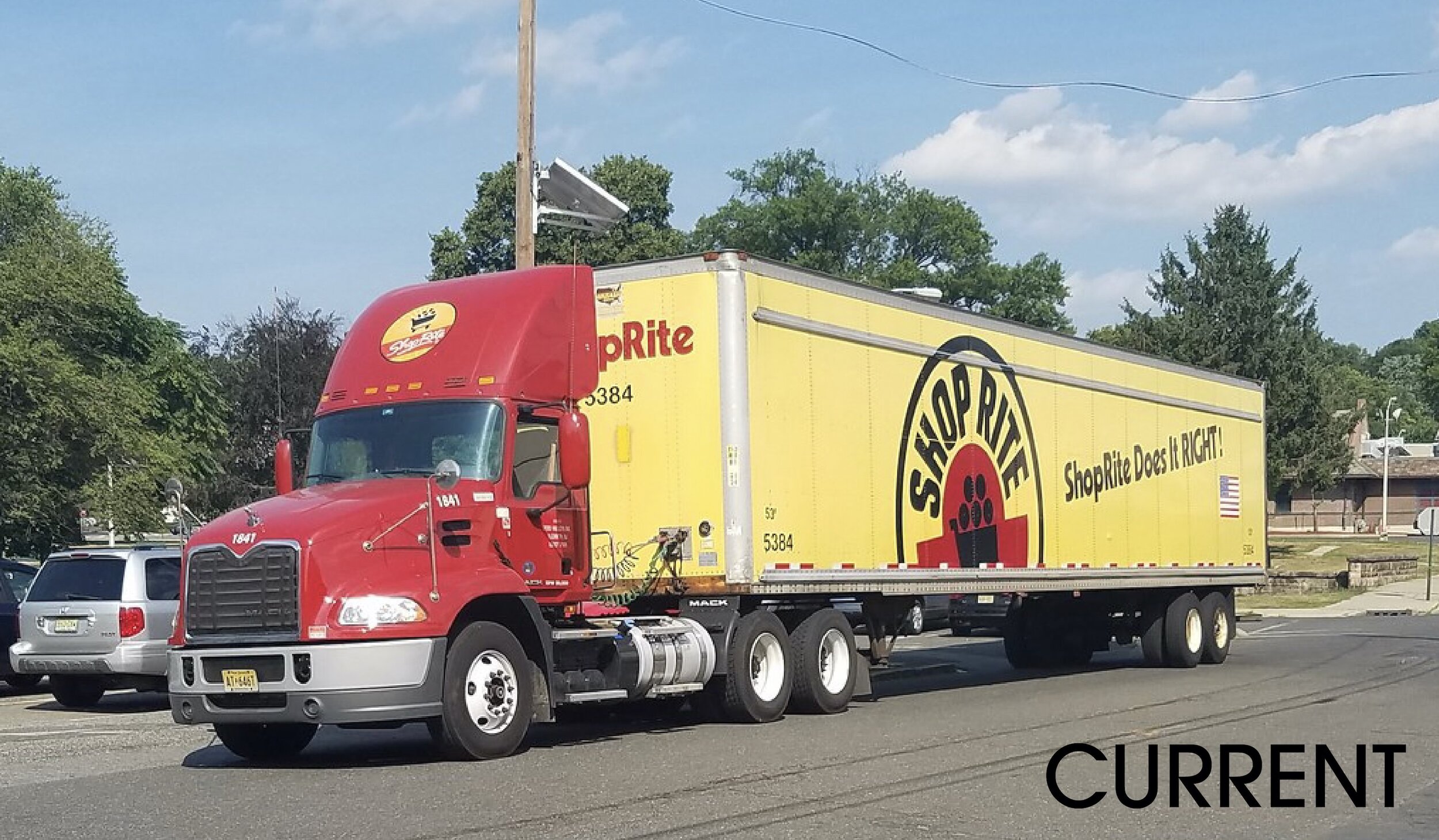
Likewise, it works well with other components of the brand’s identity like its storefronts, price plus loyalty cards, banners and in-store advertisements, as well as delivery trucks.
Throughout the process of this concept, there were several logo explorations. Ultimately landing on the one that felt most familiar and the least disruptive to the customer, these two options were close contenders.