


The idea for Kornbrekke Brewing Co. was born from the love of beer and Norway. What better way to celebrate both loves than creating a mock beer brand?
Infusing a Norwegian family surname and pieces of both family and Norwegian history into this brand’s identity was exceptionally fun.
No lack of research was done in an effort to make Kornbrekke Brewing Co. both modern in its packaging and overall design, as well as authentic in its story and personality. Understanding the types of beers brewed in Norway as well as the ways in which they were made was an important part of the foundation of this concept.
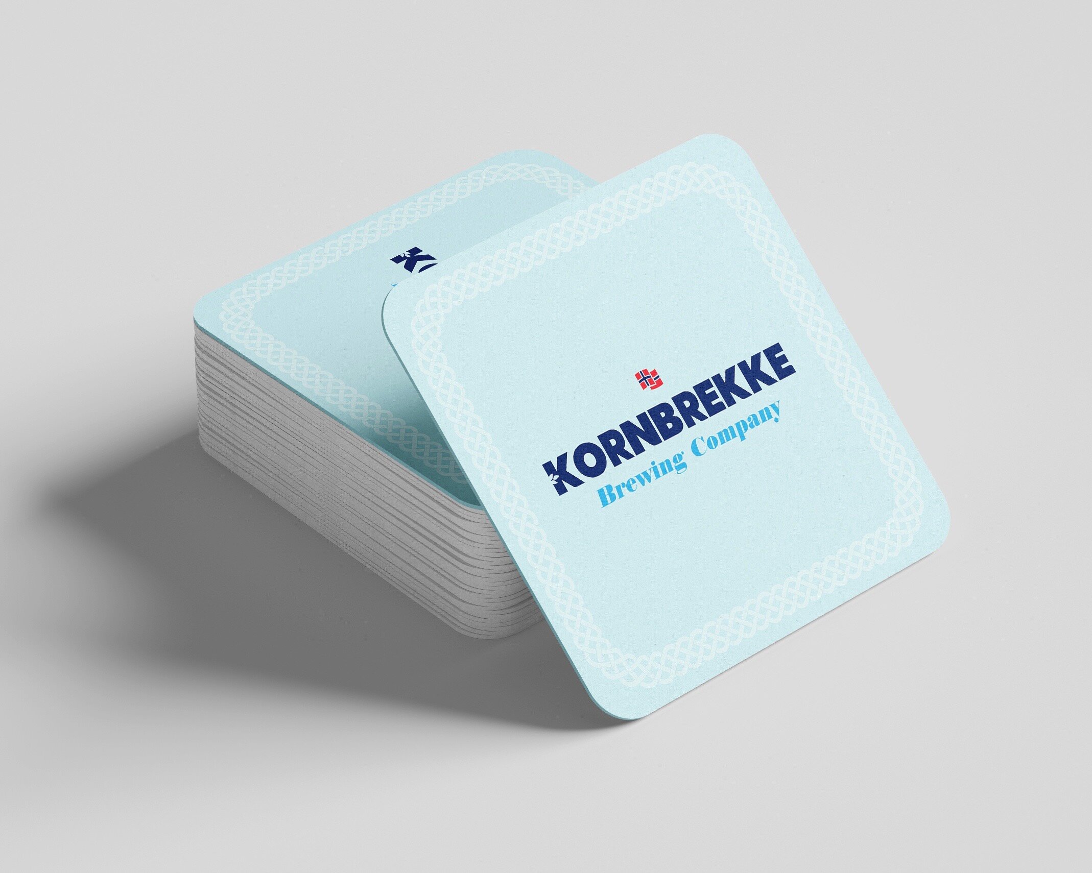
In addition, the old Viking heritage was also dutifully represented in the logo which displays the Norwegian flag, the subtle Celtic accent around the label, as well as the name of the beer, ‘Frigg’s Finest’ named after the old Norse God Odin’s wife, Frigg.
Southern Norway, the place in which the Kornbrekke family name originated, is a geographical region known for its valleys that run from the mountains to the sea. Because of that, it was important to have the packaging reflect the rolling hills, homes with sod roofing, and blue accents to reflect the blue skies and blue coast.
Research also divulged that an old “farmhouse style” technique was often used in this area, brewing beer through the process of mashing rather than boiling the beer’s ingredients. This became the focus of not only the brand’s identity but the packaging as well.
In an effort to remain both modern and relevant amongst other beer brands both in Norway and around the world, the “Big K” became a critical part of the branding as it stretched across different mediums. Being able to identify the brand by a single letter was an interesting and risky concept to play with. Yet, one that played out quite well in this mock brand.
The single letter version of the logo is both sleek and contemporary, allowing the brand to stand apart from competitors in the eyes of its young (but of-age) target market, without taking away from its historic roots. Giving it the perfect opportunity to become the recognizable “go-to” brand of beer amongst influential young drinkers who are often brand loyal.