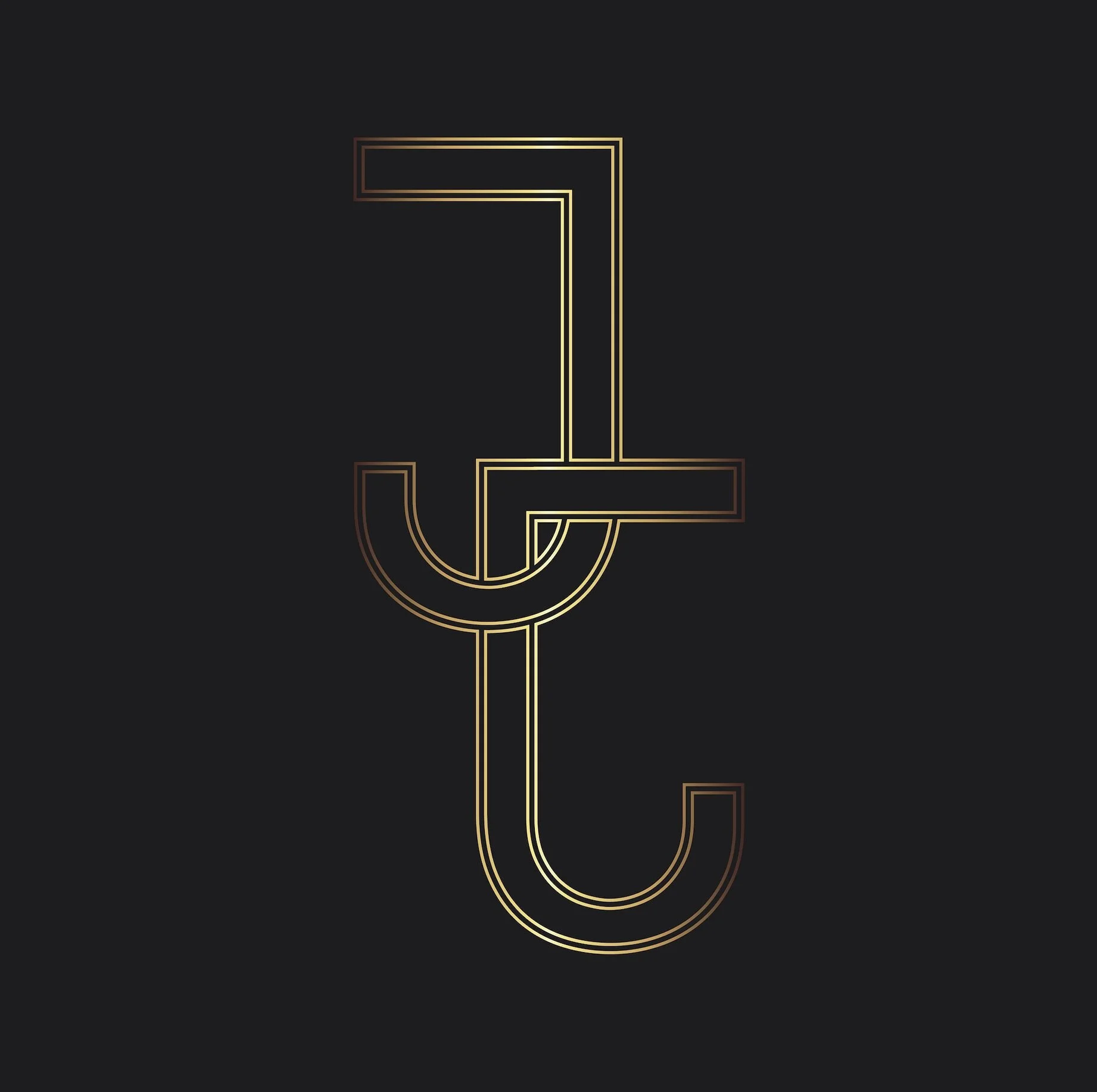


Creating a logo/brand identity for others is hard, but designing for yourself is even harder. Admiring so many different styles of design, it was easy to get lost in the process of narrowing down what fits my personality best. Ultimately, it came down to the integrity of the logo to represent both my proficiency as a designer, as well as my ability to simplify my chaotic creative thoughts into something that exhibits both professionalism and vision.
During the creative process, I decided that I wanted something sleek and simplistic, but also equally as intriguing. Using my initials, it became evident that these two letters could perform as parallels. Interlocking them gave the emblem strength and applying a gold foil effect added a hint of sophistication that I was looking for.
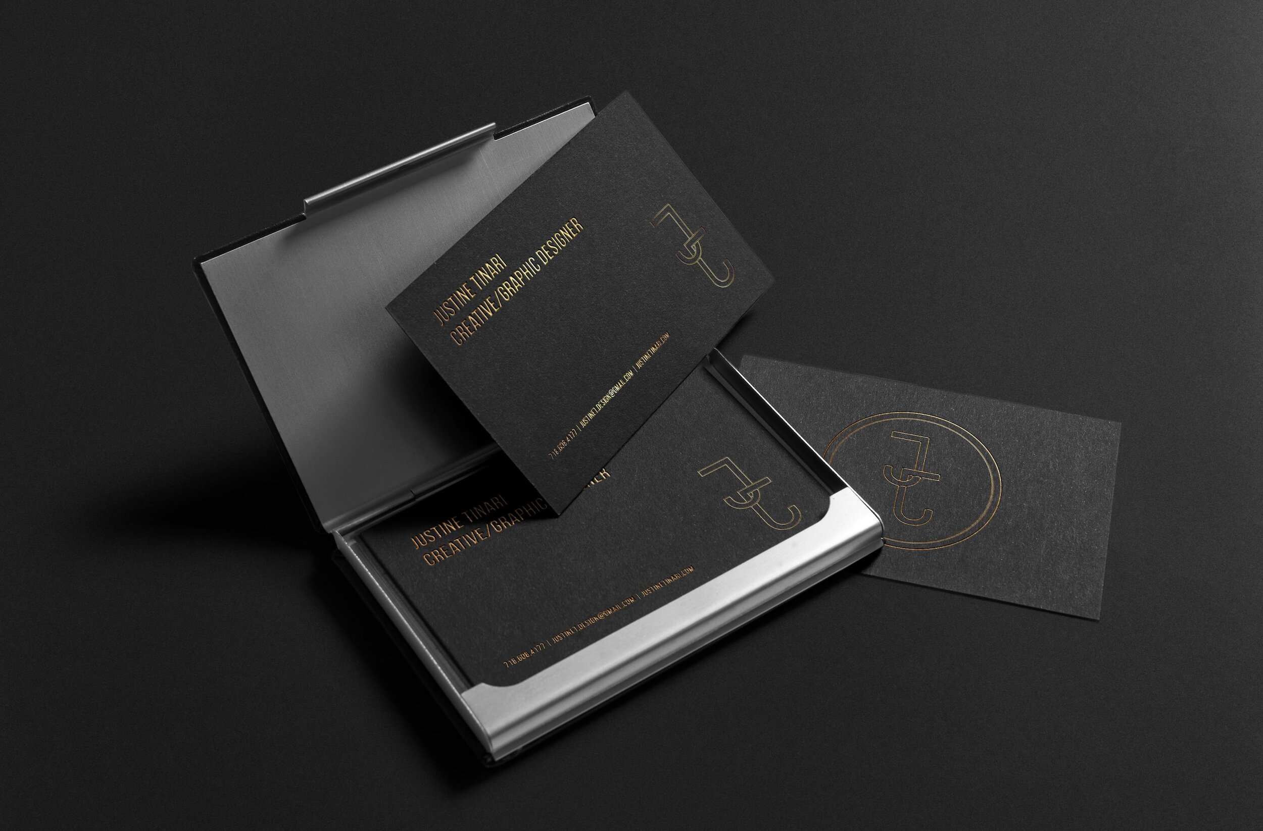
Furthermore, it was important to me that the symbol was able to be applied against different textures as well as different colors. Experimenting with such choices - it proved able to do so.